| Author |
**MaryJanesFarm Products & Merchandise:  We need your help with our cover! UPDATE! We need your help with our cover! UPDATE!  |
|
Carol
Moderator/MaryJane's Design Diva
   
453 Posts

Carol
Moscow
Idaho
USA
453 Posts |
 Posted - Jul 20 2011 : 4:23:22 PM Posted - Jul 20 2011 : 4:23:22 PM

|
Hi girls! Go To Page 4 for UPDATE!
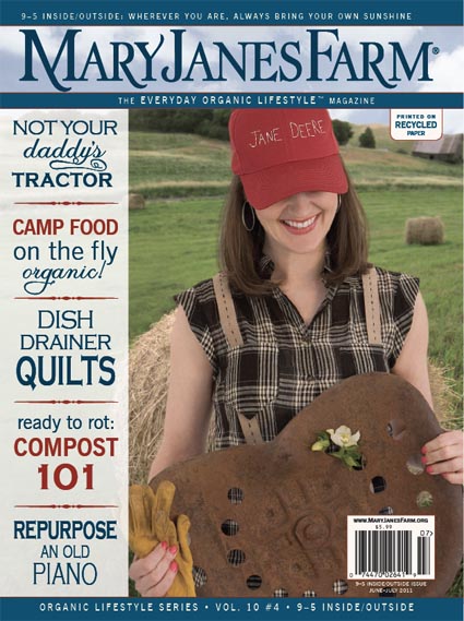
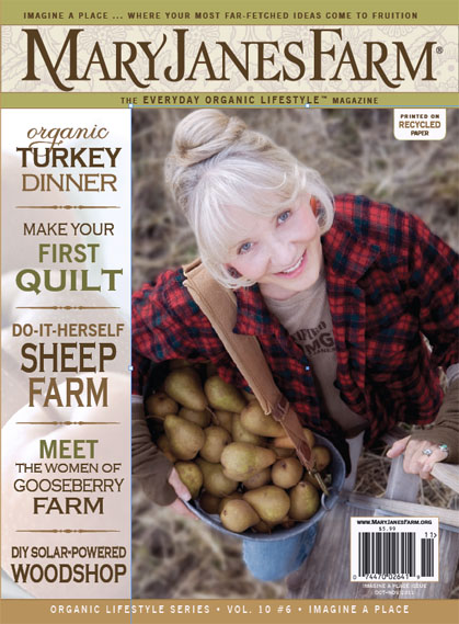
We've recently placed a semi-transparent "bar" on the left side of our magazine cover on which to place the cover text (see this treatment on the June/July 2011 cover below, featuring Megan and her "Jane Deere" hat, as well as on the preview of our next cover for Oct/Nov, showing MaryJane with her pear harvest).
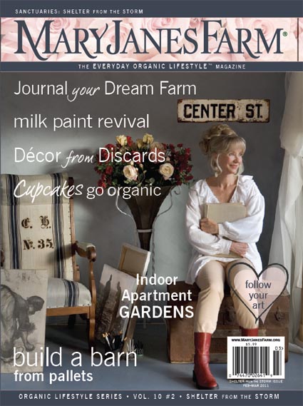
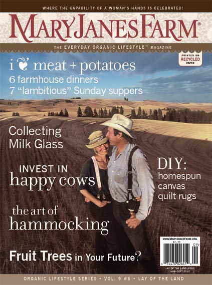
Compare this new treatment with our previous covers below from Feb/Mar 2011 (MaryJane with her "discard decor") and Aug/Sept 2010 (MaryJane and Nick). On those covers, we had text that ran across and into the photos.
Do you like the covers with the bar or do you prefer the covers without the bar?
Any feedback you give us will be greatly appreciated.
Thank you!
Carol
 
 
|
|
|
Sheep Mom 2
True Blue Farmgirl
    
1534 Posts
Sheri
Elk
WA
USA
1534 Posts |
 Posted - Jul 20 2011 : 5:33:06 PM Posted - Jul 20 2011 : 5:33:06 PM

|
I vote for without the bar.
Blessings, Sheri
"Work is Love made visible" -Kahlil Gibran |
 |
|
|
WoodstreamDreambyNicole
True Blue Farmgirl
  
177 Posts
Nicole
Marlton
NJ
USA
177 Posts |
|
|
mndreamer
True Blue Farmgirl
  
191 Posts
Vicky
Popple Creek
MN
USA
191 Posts |
 Posted - Jul 20 2011 : 5:48:31 PM Posted - Jul 20 2011 : 5:48:31 PM

|
Without the bar
~Vicky~
Live simply. Love generously. Care deeply. Speak kindly. Leave the rest to God. ~~Ronald Reagan
|
 |
|
|
embchicken
True Blue Farmgirl
    
1487 Posts
Elaine
Ocean
NJ
USA
1487 Posts |
|
|
woolgirl
True Blue Farmgirl
    
901 Posts
Elizabeth
Great Lakes
IL
USA
901 Posts |
 Posted - Jul 20 2011 : 6:41:59 PM Posted - Jul 20 2011 : 6:41:59 PM

|
I am going to be the odd one out here and say with. It is easier to read with it.
Liz
Farmgirl #1947
www.militaryfarmgirl.blogspot.com |
 |
|
|
plainandsimple72
Farmgirl at Heart

6 Posts
Lisa
Upper Midwest
USA
6 Posts |
 Posted - Jul 20 2011 : 6:42:24 PM Posted - Jul 20 2011 : 6:42:24 PM

|
| I prefer without also. |
 |
|
|
Blessed in Colorado
True Blue Farmgirl
    
7542 Posts

Debbie L.
Oregon
USA
7542 Posts |
|
|
melody
True Blue Farmgirl
    
3337 Posts
Melody
The Great North Woods in the Land of Hiawatha
USA
3337 Posts |
 Posted - Jul 20 2011 : 7:48:09 PM Posted - Jul 20 2011 : 7:48:09 PM

|
Definitely without the bar Carol! That way it doesn't look so boxed in-And, you can see more of the cover photo!!
Melody
Farmgirl #525 |
 |
|
|
LightGreenThumb
True Blue Farmgirl
  
170 Posts

Elizabeth
Spokane
WA
USA
170 Posts |
 Posted - Jul 20 2011 : 8:14:50 PM Posted - Jul 20 2011 : 8:14:50 PM

|
I got the whole family in on the voting. We like the cover with the full photo and no bar best however, the clean easy to read text in the bar has it's merits as well. Mainly, I just like what's on the inside. The magazine is never long enough! I always run out of pages before I run out of interest. :)
Elizabeth <><
Farmgirl #3091
Simplicity is Beautiful. |
 |
|
|
Alee
True Blue Farmgirl
    
22944 Posts

22944 Posts |
 Posted - Jul 20 2011 : 8:59:40 PM Posted - Jul 20 2011 : 8:59:40 PM

|
I like the covers without the bar. It feels more open and the pictures look in better proportion to the size of the page. I also like the free feeling of the topic ideas. I don't really have words other than if feels more free spirited and not so boxed in. Like Elizabeth mentioned- the bar had it's merits but having it be such a lighter tone than the rest of the cover really draws the eye to the bar when the picture (in my opinion) should be the eye catcher.
Alee
Farmgirl Sister #8
www.farmgirlalee.blogspot.com
www.allergyjourneys.blogspot.com
|
 |
|
|
Ninibini
True Blue Farmgirl
    
7577 Posts
Nini
Pennsylvania
USA
7577 Posts |
 Posted - Jul 20 2011 : 9:49:44 PM Posted - Jul 20 2011 : 9:49:44 PM

|
Yeah, I'm for without the bar, too. Alee said it best. To me, not having the bar is just so much more "Mary Jane." It's more gentle, clean, natural and easy - more organic, more soulful. Without the bar, when reading the article titles, it's as if you're looking through a window into MaryJane's world, and reading what comes from her heart as opposed to when you're looking at that uber-professional bar. Whatever you decide, though, we just love the magazine - so just please be sure to keep them coming! ;)
Farmgirl Sister #1974
God gave us two hands... one to help ourselves, and one to help others!
www.papercraftingwithnini.myctmh.com
|
 |
|
|
debbiesuew
Farmgirl at Heart

2 Posts
Debbie
Palmyra
MI
USA
2 Posts |
 Posted - Jul 21 2011 : 05:56:09 AM Posted - Jul 21 2011 : 05:56:09 AM

|
| The bar is so much easier to read. So I'm with the bar! |
 |
|
|
StrawHouseRanch
True Blue Farmgirl
    
1044 Posts
Paula
Holt
Missouri
USA
1044 Posts |
 Posted - Jul 21 2011 : 06:48:27 AM Posted - Jul 21 2011 : 06:48:27 AM

|
From a marketing perspective, the information in the bar would project itself better on a news stand, but I much prefer the warm fuzzy feeling I get from looking at the covers without the bar...more artsy, natural, free-form, creative...just like what the magazine is about. The beautiful photography on the cover is enough to grab attention on the news stand and lure the consumer in to examine more closely what is written in the text areas. The photos on the covers with the bars look too cropped. Top of hats, arms, items of interest are all chopped out of the photo.
Paula
Farmgirl Sister #3090
A Beehive is the ultimate Home Sweet Home
|
 |
|
|
Penny Wise
True Blue Farmgirl
    
1903 Posts
Margo
Elyria
OH
USA
1903 Posts |
 Posted - Jul 21 2011 : 07:03:07 AM Posted - Jul 21 2011 : 07:03:07 AM

|
i'm torn---it's easier for me to read with the bar becuz i have macular degeneration and look for larger print things--however; it IS nice to see the entire photograph!!!
I know that didn't help-but-you asked!!!
Farmgirl # 2139
~*~ counting my pennies and biding my time; my dreams are adding up!~*~ |
 |
|
|
RubyJunes
True Blue Farmgirl
   
246 Posts
June
Greenwich
Ohio
USA
246 Posts |
 Posted - Jul 21 2011 : 07:57:46 AM Posted - Jul 21 2011 : 07:57:46 AM

|
I vote with the bar...makes the text easier to read!
--June
Farmgirl #545
www.RubyJunes.blogspot.com
|
 |
|
|
gathered herb
True Blue Farmgirl
  
87 Posts
Patty
Ormond Beach
florida
USA
87 Posts |
 Posted - Jul 21 2011 : 08:33:56 AM Posted - Jul 21 2011 : 08:33:56 AM

|
I love the covers both ways.... easy to read! however, I like the full picture view the bestie!
patty. |
 |
|
|
Joey
True Blue Farmgirl
    
1868 Posts
Joey
Gulf Coast
FL
USA
1868 Posts |
 Posted - Jul 21 2011 : 08:59:19 AM Posted - Jul 21 2011 : 08:59:19 AM

|
I like the bar for 2 reasons..first it is easier for me to read and second-sometimes I think the pictures are nice enough to frame but I don't want all the words running thru it. So, I vote for the bar. Joey
Well behaved women rarely make history. |
 |
|
|
Karrieann
True Blue Farmgirl
    
1900 Posts

Karrieann
Northeast
Georgia
USA
1900 Posts |
 Posted - Jul 21 2011 : 09:19:51 AM Posted - Jul 21 2011 : 09:19:51 AM

|
...I like the bar. It is easier to read that without. Sometimes it is difficult to read the words with busy backgrounds. For instant, on the cover of MaryJane with Center Street, the word "cupcake" get a bit lost with the chair.
Karrieann ~ Farmgirl Sister #766 (29 Sept 2009)
My Blog: ...following my heart, dreams and Jesus ...http://karrieann-followingmyheartandjesus.blogspot.com/
My Etsy ...Yesterday's Scraps, Tomorrow's Treasures ...http://www.etsy.com/shop/2TomorrowsTreasures
|
 |
|
|
herb19355
True Blue Farmgirl
   
321 Posts
Debi
Danielsville,
GA
USA
321 Posts |
 Posted - Jul 21 2011 : 10:07:00 AM Posted - Jul 21 2011 : 10:07:00 AM


|
I vote for the bar too!
Debi
GA Farmgirl #2515 |
 |
|
|
Sharon Denise
True Blue Farmgirl
   
211 Posts
Sharon
Temple
TX
USA
211 Posts |
 Posted - Jul 21 2011 : 12:09:20 PM Posted - Jul 21 2011 : 12:09:20 PM

|
I really like the easier-to-read fonts/colors on the covers with the bar, but it is nice to have the full picture. I'm torn on this one.
"There will come a time when you believe everything is finished. Yet that will be the beginning."
~Louis L'Amour |
 |
|
|
BarnChickCecily
True Blue Farmgirl
    
673 Posts
Cecily
Corydon
IN
USA
673 Posts |
 Posted - Jul 21 2011 : 12:35:12 PM Posted - Jul 21 2011 : 12:35:12 PM

|
I vote for without the bar...it is prettier, more elegant, daintier, and artsy. The bar just seems more boxy and the beautiful picture is much smaller and closed in. Free the picture ;)
Farmgirl Sister # 241
www.thebarnchick.blogspot.com/ |
 |
|
|
Alee
True Blue Farmgirl
    
22944 Posts

22944 Posts |
|
|
BarnChickCecily
True Blue Farmgirl
    
673 Posts
Cecily
Corydon
IN
USA
673 Posts |
 Posted - Jul 21 2011 : 12:48:57 PM Posted - Jul 21 2011 : 12:48:57 PM

|
Maybe they could put it on the back cover, or inside the back cover??
Farmgirl Sister # 241
www.thebarnchick.blogspot.com/ |
 |
|
|
BarnChickCecily
True Blue Farmgirl
    
673 Posts
Cecily
Corydon
IN
USA
673 Posts |
 Posted - Jul 21 2011 : 12:51:12 PM Posted - Jul 21 2011 : 12:51:12 PM

|
OR....if you are in the sisterhood, at the end of the year, they could mail each sister print outs of every cover from the year...a perk!
Farmgirl Sister # 241
www.thebarnchick.blogspot.com/ |
 |
|
|
Montrose Girl
Farmgirl Legend/Schoolmarm
    
1360 Posts
Laurie
Montrose
CO
1360 Posts |
 Posted - Jul 21 2011 : 1:09:18 PM Posted - Jul 21 2011 : 1:09:18 PM

|
At first I had a without the bar thought. I thought the cover flowed as one unit. the more I look though the more cluttered the cover seems when the bar is not there. I think it is a difference of what you want to stand out more -- the picture (with bar), or the text (without bar). With the bar definitely makes them two units, where without makes the cover more cohesive as a unit.
http://www.inntheorchardbnb.com/ |
 |
|
**MaryJanesFarm Products & Merchandise:  We need your help with our cover! UPDATE! We need your help with our cover! UPDATE!  |
|