| T O P I C R E V I E W |
| Carol |
Posted - Jul 20 2011 : 4:23:22 PM
Hi girls! Go To Page 4 for UPDATE!
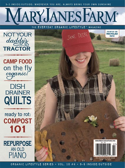
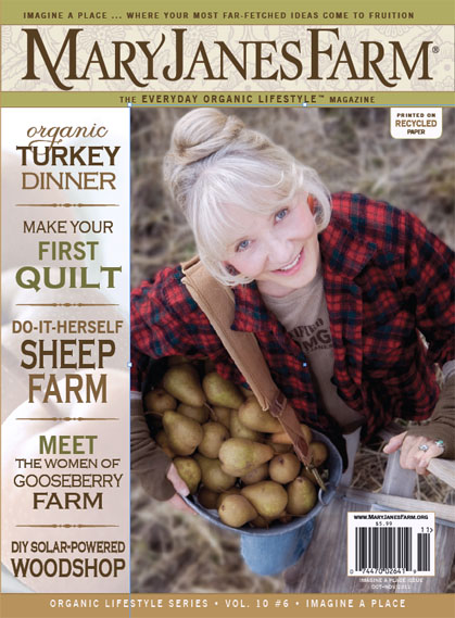
We've recently placed a semi-transparent "bar" on the left side of our magazine cover on which to place the cover text (see this treatment on the June/July 2011 cover below, featuring Megan and her "Jane Deere" hat, as well as on the preview of our next cover for Oct/Nov, showing MaryJane with her pear harvest).
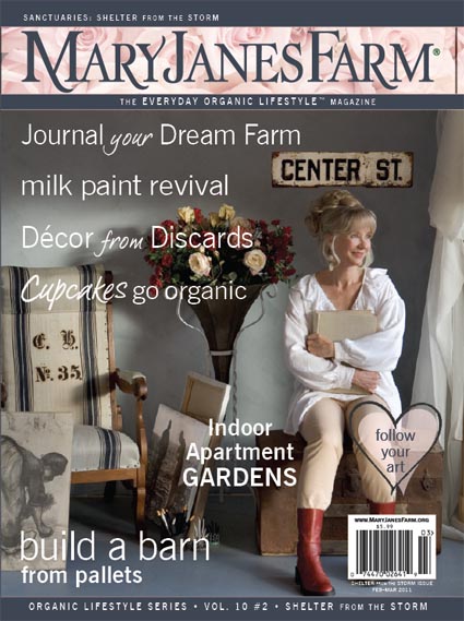
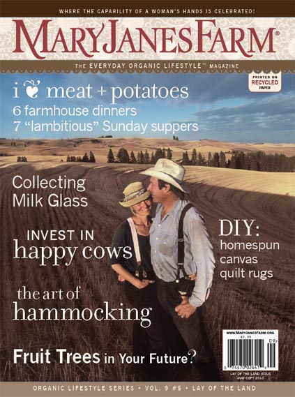
Compare this new treatment with our previous covers below from Feb/Mar 2011 (MaryJane with her "discard decor") and Aug/Sept 2010 (MaryJane and Nick). On those covers, we had text that ran across and into the photos.
Do you like the covers with the bar or do you prefer the covers without the bar?
Any feedback you give us will be greatly appreciated.
Thank you!
Carol
 
 
|
| 25 L A T E S T R E P L I E S (Newest First) |
| naturemaiden |
Posted - Aug 23 2011 : 05:26:50 AM
#1
http://www.naturemaiden.com/- Soap & Candle
http://flowerchild-lifeinthegarden.blogspot.com/ My Blog
http://groups.yahoo.com/group/farmgirl-crafting-group/ - A group for all farmgirls wanting to share their craft.
|
| Killarney |
Posted - Aug 21 2011 : 10:21:55 AM
Can't wait for the next issue! I so adore being A farmgirl! and being a part of this wonderful Sisterhood.! |
| MaryJane |
Posted - Aug 21 2011 : 10:12:15 AM
We can't thank you enough for how helpful your comments have been. This was essentially two separate surveys. The first survey came in at 60% for w/o a bar and the second survey (once we narrowed it down) came in at 80% w/o a bar. Your comments were so thoughtful and some of them thorough and MIGHTY helpful. We went without the bar but with concise boxed-in text as if the bar were still there. When you get it, let us know what you think.
You should be receiving our Oct/Nov (Imagine a Place) in the mail in another 2-3 weeks. Again, MANY thanks. We have just the very BEST readers!!
MaryJane, Farmgirl #1 Plowin' Thru ~ giving aprons a good wrap for 45 years and counting ~
 |
| sweettea |
Posted - Aug 17 2011 : 3:25:32 PM
I choose number 1. It is so much easier to read the cover text on the bar. My opinion is that it will stand out better on the newsstands also. People give things a 5 second scan. You need to grab them in those 5 seconds with what's on the cover. I believe the mixture of the great photo and the easy to read text in the bar will do that.
"There are two ways to live: you can live as if nothing is a miracle; you can live as if everything is a miracle." Albert Einstein |
| walkinwalkoutcattle |
Posted - Aug 16 2011 : 4:27:34 PM
#2 is a winner for me. Gooseberry farm? Yes please! Organic turkey dinner? Heck yes! I think what it boils down to, for me, in this cover, is the muted, toned down colors-perfect for fall. You can just imagine MaryJane taking those potatoes in to make a nice soup, or chicken pot pie. You can almost feel the chill of the morning air on the cover of that magazine!
Farmgirl #2879 :)
Starbucks and sushi to green fried tomatoes and corn pudding-I wouldn't change it for the world.
www.cattleandcupcakes.blogspot.com
|
| debtea2 |
Posted - Aug 15 2011 : 5:11:15 PM
#2 is perfect and lovely
inch by inch we find our way
jersey farmgirl
#1330
|
| Killarney |
Posted - Aug 11 2011 : 6:56:22 PM
I like it better without the bar, it interupts the Beauty of the picture on the cover too much! |
| jpbluesky |
Posted - Aug 11 2011 : 6:51:02 PM
Cover two!!!! Photo should take all.......That is what meets the eye first, copy second. Don't cheat the photo.
Farmgirl Sister # 31
www.blueskyjeannie.blogspot.com
Psalm 51: 10-13 |
| WoodstreamDreambyNicole |
Posted - Aug 11 2011 : 2:36:17 PM
Cover 2, it's crisp with the picture, but still has text available for information. I like that the text isn't all over the picture. I like that there isn't a distracting bar on the cover.
Nicole
Shop
www.woodstreamdream.etsy.com
Custom Creations
www.woodstreamdream.blogspot.com |
| missusprim |
Posted - Aug 11 2011 : 2:32:29 PM
#2. You get a bigger view of the picture (as in more background) which gives you a bigger concept of what the picture itself it about. In other words, I'd like to see the background of a field IN the picture of someone with a bushel of pears versus just someone cut out and showing just her and her pears.
The snippets of what's inside towards the left withOUT the bar let's you view what's in the issue but isn't overshadowing the picture itself. Having the bar is too much 'clutter' to a magazine front and I think Mary Jane's is too classy (as farm girls can be!) to have it look like the other mags on the market. Let MJF's stand out as a mag with some panache!
And BTW, what a cute pic of MaryJane!
Farmgirl Sister #2984
"Animals are such agreeable friends - they ask no questions, they pass no criticisms." George Eliot
http://farmchicatheart.blogspot.com/
|
| peapicker |
Posted - Aug 11 2011 : 05:26:29 AM
Number 2 is perfect. Easy to read and we still get the full photography. Good photo's are as important as the written material to me.
Enjoy the little things, for one day you may look back and realize they were the big things.
Robert Brault |
| texdane |
Posted - Aug 11 2011 : 05:13:50 AM
I pick #2, too!
Nicole
Farmgirl Sister #1155
KNITTER, JAM-MAKER AND MOM EXTRAORDINAIRE
Chapter Leader, Connecticut Simpler Life Sisters
Suburban Farmgirl Blogger
http://sfgblog.maryjanesfarm.org/ |
| ddmashayekhi |
Posted - Aug 10 2011 : 7:01:48 PM
I think 2 is the best one too. Maryjane looks as beautiful as ever and the bar without a color background informs us what is in the magazine without detracting from the gorgeous picture.
Dawn in IL |
| Oggie |
Posted - Aug 10 2011 : 08:17:47 AM
They are both great!
Ginny
Farmgirl #2343
www.thedewhopinn.com
"I always have a wonderful time, wherever I am, whomever I'm with."
"Well, I've wrestled with reality for 35 years, Doctor, and I'm happy to state I finally won out over it." Both by Elwood P. Dowd (Jimmy Stewart) in the Movie Harvey
|
| Wildcrafter |
Posted - Aug 10 2011 : 07:28:42 AM
Looks like the majority is saying #2. I agree. Easy to read, I like that the picture is included with the wording on the left. Very easy to read, pleasant to look at.
Also, the font and capital letters are easy to read and bold...they stand out. I like that the color of the words are uniform. Too many different colors make it too 'busy' in the first one.
When and where do I get my copy?
----------------------------------------------------------
Cedar Mountain Herb School and Botanicals
www.cedarmountainherbs.com
Become a fan! https://www.facebook.com/pages/Cedar-Mountain-Herb-School/199194060117277
|
| SRhea |
Posted - Aug 10 2011 : 06:14:39 AM
#2 is the best.
In one of your magazines you wrote about paper towels and I believe it was under Simple Solutions. I have been trying to find it again to reread it and don't remember what issue it was in. Is it on the website? |
| sonshine4u |
Posted - Aug 10 2011 : 06:02:54 AM
Number 2 for sure! Nice work!
Playing in the Sonshine
|
| arabianhorselover |
Posted - Aug 08 2011 : 11:03:11 PM
I pick number 2. It just flows much nicer!
Hugs!
jennifer
Breeder of Straight Egyptian Arabians and SportHorses
www.whisperwindsarabians.com
Farmgirl Sister #561
Never squat with your spurs on!!!
www.throughjenslens.etsy.com
http://twitter.com/arabhorselover
http://kountrybumkinfarmgirl.blogspot.com/
http://fancyfeathersfarmgirls.blogspot.com/ |
| KarenP |
Posted - Aug 08 2011 : 3:20:49 PM
I'd go #2 or #3.
I have always loved MJF photos so the more I see, the more I like!
my 2 cents
Karen
"Purest Spring Water in the World" |
| knit-together |
Posted - Aug 07 2011 : 12:35:16 PM
#1 is OUT - I almost thought I'd pick #2, but as I went back to read what the articles would be #3 was more clearly written. I was able to read them quickly while still "seeing" the cover picture. Sorry to throw a wrench into things, but I also liked the scallopped edging under the Title, where it says. . . "the everyday organic lifestyle magazine".
**P.S. I LOVE your magazine so much, I would buy it no matter what** |
| Farmer Judy |
Posted - Aug 01 2011 : 08:42:53 AM
OK, I think #2 is best also...it has the format of the bar without the actual change of background. It works for me
Judy
Born a city girl but a farm girl at heart! |
| Montrose Girl |
Posted - Aug 01 2011 : 07:33:14 AM
I agree with #2. It gives you the titles to the side, but doesn't break up the cover with the bar. The cover flows nicely without the words getting all over the photo.
Laurie
http://www.inntheorchardbnb.com/ |
| SRhea |
Posted - Aug 01 2011 : 06:37:23 AM
 I like #2 the best. I like #2 the best.
In one of your magazines you wrote about paper towels and I believe it was under Simple Solutions. I have been trying to find it again to reread it and don't remember what issue it was in. Is it on the website? |
| JojoNH |
Posted - Aug 01 2011 : 04:23:43 AM
I would pick #2
It's easy to read, you still get to see the entire picture and it makes an overall pleasing impression. . makes me want that issue now!! LOL!
Joanna #566
JojoNH
www.countrycents.com
http://www.etsy.com/shop/CountryCents
http://CountryCents.Blogspot.com
www.JoannasHomeStudio.com "Keeping traditions alive a stitch at a time"
http://twitter.com/NHJoanna |
| chessie |
Posted - Jul 31 2011 : 9:49:26 PM
I pick cover número UNO (1) because I can read it the easiest and MJ is showcased all at the same time. On no. 2 it was hard for me to focus on MJ and no. 3 it was hard for me to focus the content. No matter which cover is chosen though, I can' t wait to read the issue!
www.edgehillherbfarm.com "Where the name is bigger than the farm, but no one seems to mind!"
blog http://edgehilherbfarm.blogspot.com/
"Happy Glamper" farmgirl #89 |